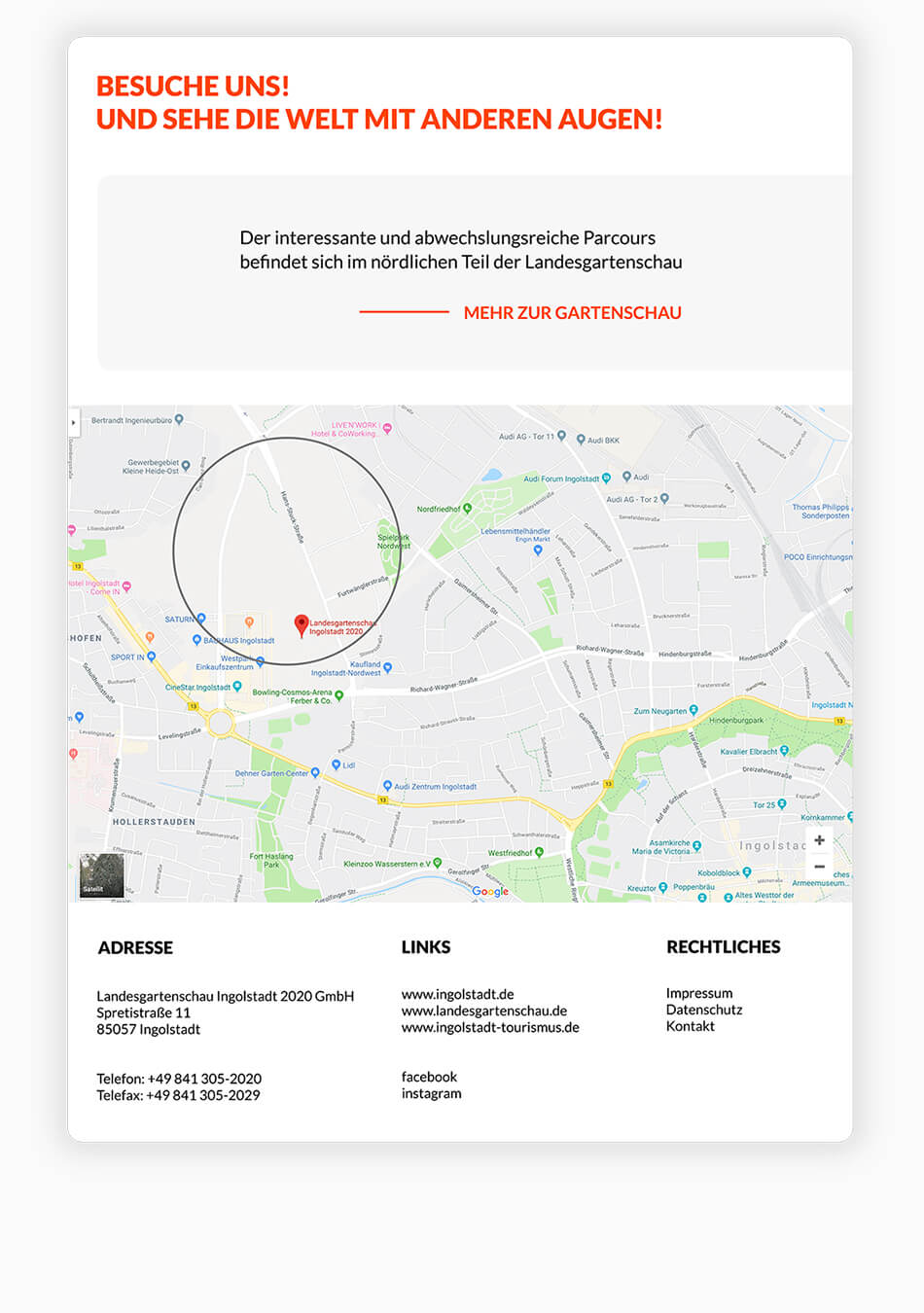
In cooperation with the Landesgartenschau Ingolstadt
My role: Building an icon set and screen design for the sustainability course
of the Landesgartenschau 2020
Semester: 2
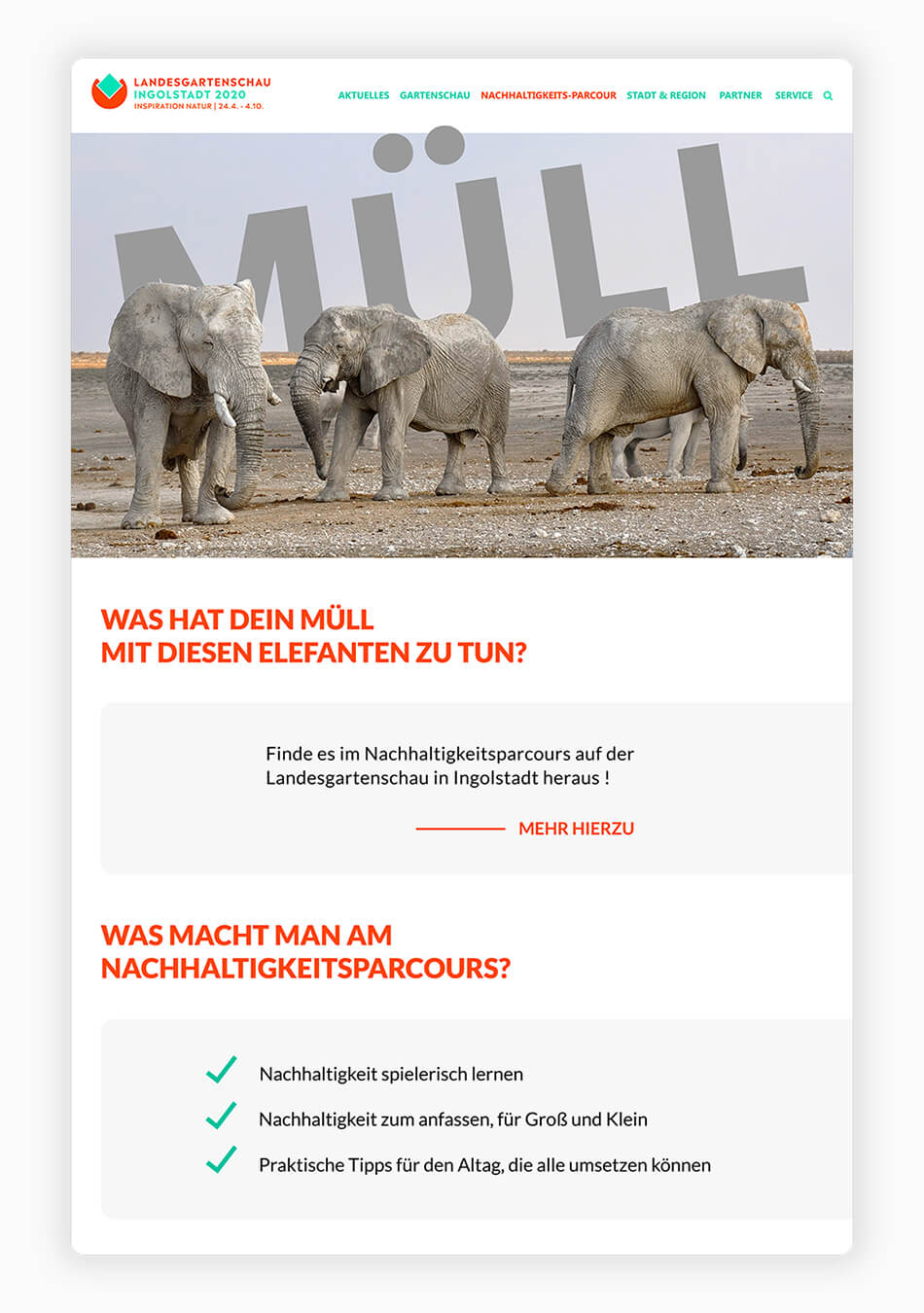
The intention of the Landesgartenschau Ingolstadt was to create a grasp of sensitivity
regarding to the sustainability topic. In focus was the sustainability parkour, which
should sensitize young and old, to act more sustainable in their every day lifes
On this occasion, the UX students of the 2nd semester had the chance
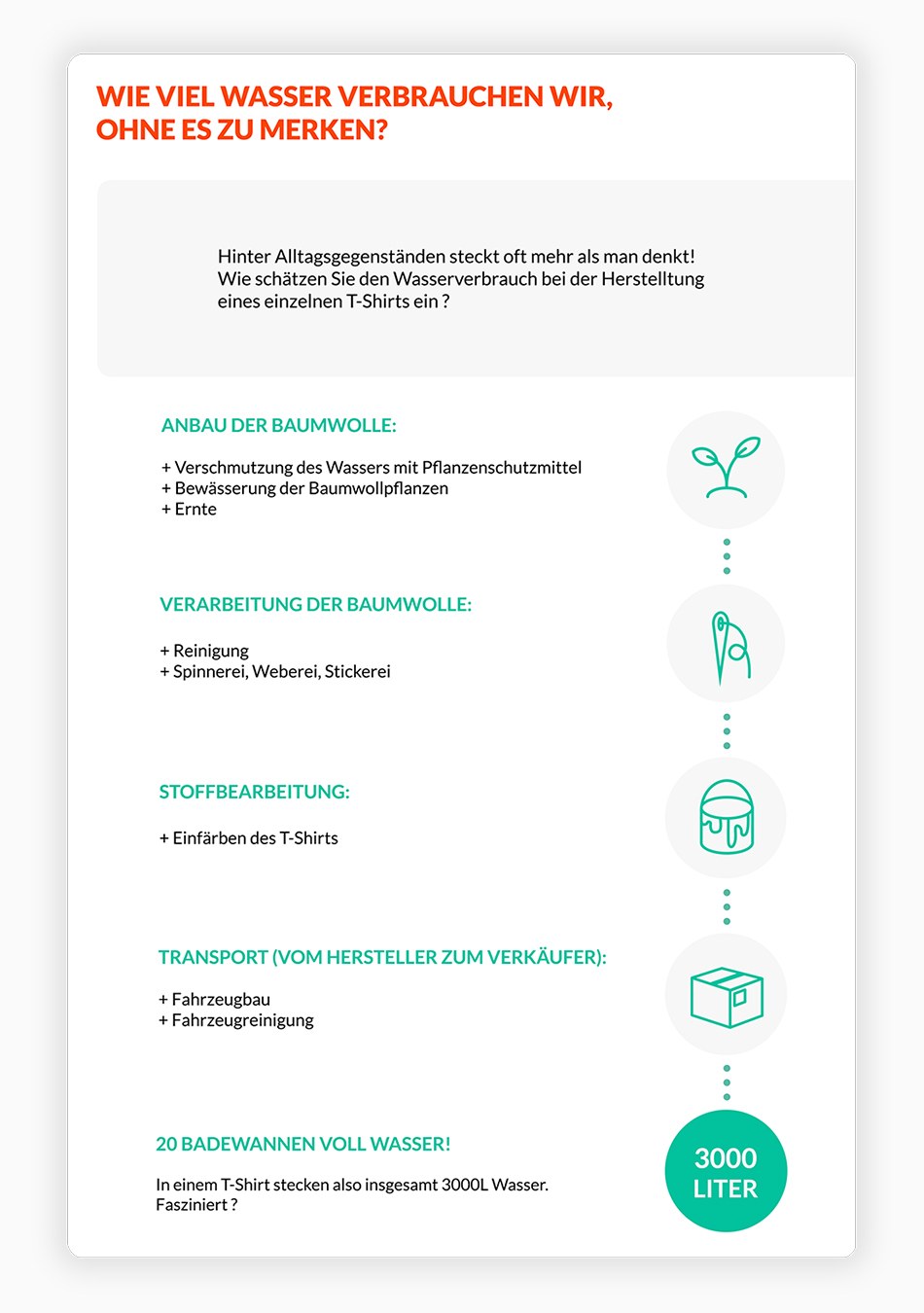
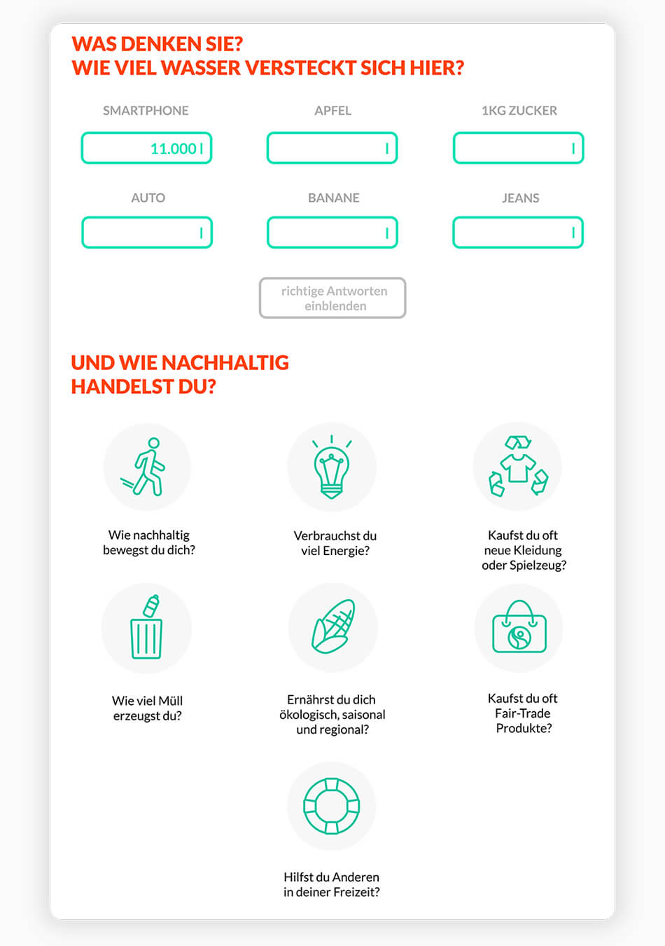
to develop a screen design for the website of the sustainability course.
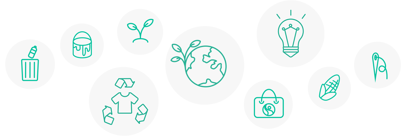
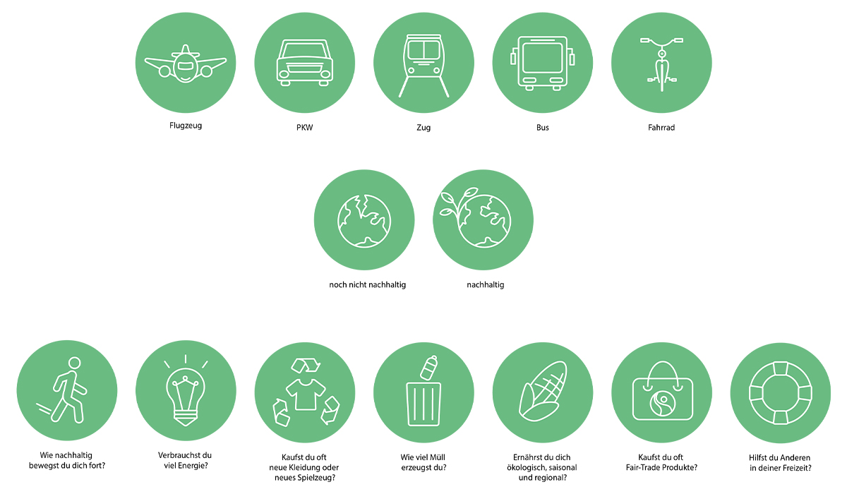
A part of the task was also, to design icons which can be seen later on an information board of
the course and on the website.
The website of the Landesgartenschau is designed with very distinctive red and green tones.
This color scheme demands special attention in the composition.
The screen design should also convince younger visitors.
Due to the site of the Landesgartenschau is very strikingly designed with dominant colors,
I focused on expressive and minimalistic icons. It also had to be considered that the
icons are also displayed on an information board.
At the beginning I created different icons for different topics. In order to appeal younger
people I added few playful vibes. Afterwards we discussed the built metaphers in the group.
The screen design begins with an eyecatcher. The presentation should attract attention and should be though-provoking. In order to balance the complementary contrast of the colouring, I usually worked with typography, grey tones and gradations of the colours.
The design should directly catch to the visitor. Questions and statements are also visually underlined by the created icons. The visitor should keep the content in mind.
One of the last parts of the onepager consists out of a little quiz. The user has to estimate the water consumption of everyday products, which transfers a good overview for this topic.